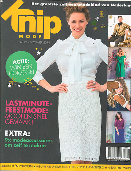
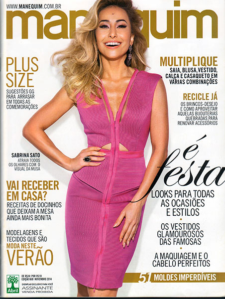
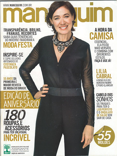
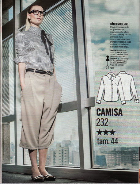
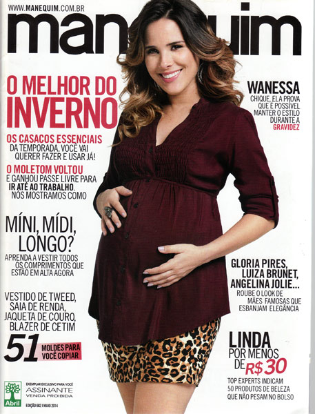
Manequim magazine May 2014

It is an excellent time to be a pattern magazine subscriber, and I think this week’s posts on the June Burda, April Manequim, and now this May issue are a great illustration on the variety and fashion forward elements that just aren’t being seen in the Big Four right now.

The other two issues this week have been fantastic, but this May issue may just top them all… I don’t think I’ve ever scanned so many pages from one magazine before!

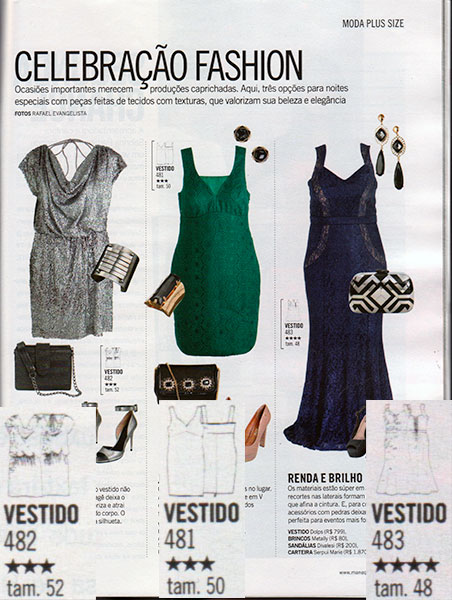
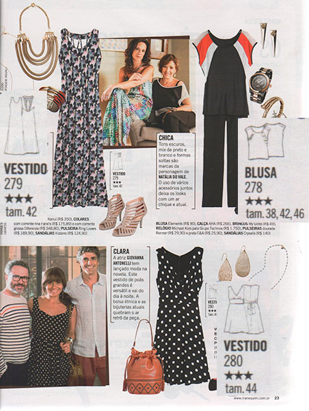
First up are the Plus offerings for this issue – three different dresses all with illusion-type colourblocking made popular by Stella McCartney recently.

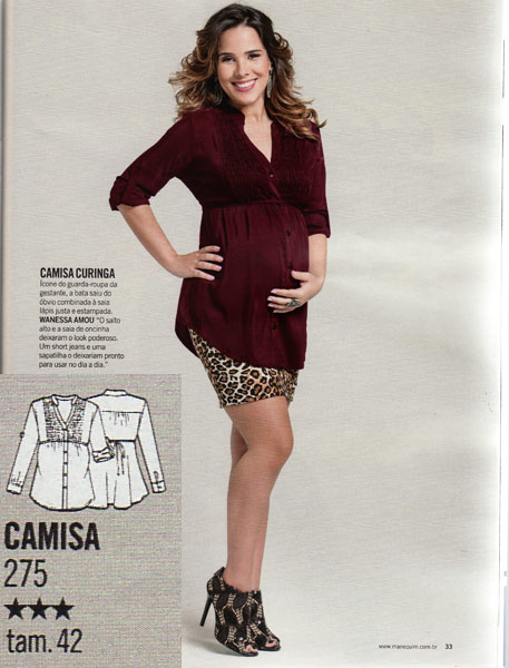
As you may have guessed from the cover, there are maternity patterns included this month for the first time that I’ve ever seen! The cover blouse is the nicest IMHO, but there’s also patterns for a skirt, trousers, and a caftan-like dress, too.

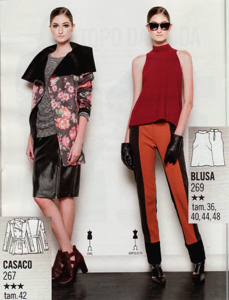
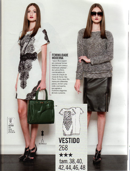
The designer style patterns this month use Jason Wu as their inspiration and we get a really intricate jacket with wide lapels but loads of the sleeve details are just swallowed by the floral print. There’s also a cutaway shoulder blouse with a wide hem in multiple sizes, and also a dress with some stunning lace appliques. It might be difficult to source a similar lace, but the dress pattern is offered in a whopping 6 sizes, so it’s a great pattern to have as a jersey base for comparing against & modifying to become other styles not in your size.

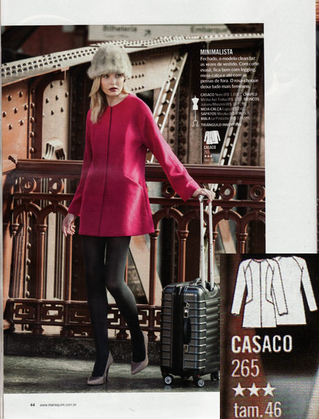
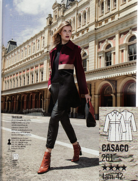
I stopped buying Patrones magazine a while back as I only ever really liked the winter issues anyway, and I was getting a bit bored of their styles. But to me, Patrones really made the best coat patterns ever. Let me tell you, this coat feature here is enough to make me burn all my back issues of Patrones and sew all of these instead.

Take this pink coat for starters – immaculate clean lines – the princess seam goes straight into that angle to form the pocket. The raglan seams draw the eye to the face, and there’s no collar in the way to distract from the simplicity. YES.

This pattern appears to have everything I’d ever want from a motorcycle jacket, and sewn in coating rather than leather. Again, the attention to detail here is great – I only wish I could see more clearly what’s going on with that right side (as worn) pocket…

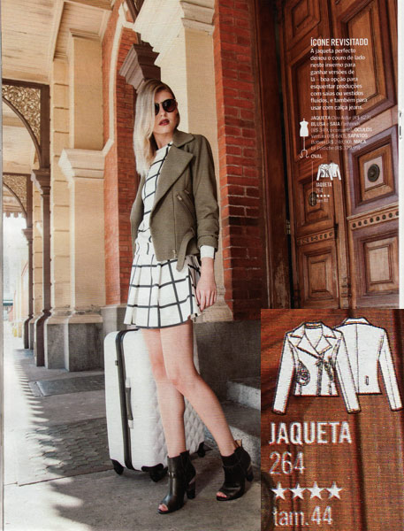
Again with the crazy amount of details and fabric mixing – is it a trench coat? Is it a biker jacket? It’s apparently made with faux leather, coating, and a polyester (presumably the fabric with the holes) and you know how much I love to mix different textures in the same colour!

And lastly in the coat feature, I adore this colourblock coat with the stripe running through just above the waist. Very striking but very classic at the same time.

Now some of my long-time readers may recall that in the very first issue of Manequim I ever had there was a feature on chic uses for sweatshirt and I squealed with delight. OMG IT’S ANOTHER CHIC SWEATSHIRTING FEATURE. And this time it’s even better. I had to restrain myself to even leave one pattern out of my picks.

This dress! You could totally leave the lower sleeves off and it’d work well with cap sleeves, too!

KnipMode magazine – December 2014

What a blast from the past, right?? Some longterm readers may recall that I used to subscribe to the Dutch pattern magazine, KnipMode, but the quality of the designs really went downhill when they appointed a new editor and I let my subscription expire back in 2012. It was an easy choice, since it was the most expensive of my magazine subscriptions, but when I get the opportunity, I still pick up the odd issue from continental newsstands.

Well, we were in Brussels shortly before Christmas for a festive weekend at the Christmas market, and on our drive back we stopped in at a Belgian supermarket. I was surprised to find KnipMode on the magazine rack, and I couldn’t resist seeing what KnipMode were up to these days. Clearly loads has happened since 2012, as they’ve not only had a complete redesign, but have a new publisher as well! The editor I blamed for the downhill spiral is still there (grumble grumble) but the designs look decent in this one, so I’ll hold out hope…


“Knip” means “cut” in Dutch, so I think the new scissor logo is quite cute!

First up is a green party dress with lots of gathering and a nice surplice neckline. It’s not a million miles away from my 30th birthday dress, which is probably why I was drawn to it!

This tie-hem shirt is styled for a party here, but I think this could be a really great casual top, too. It’s made for wovens, and with the kimono sleeve it means there’s only two patterns pieces plus the hem binding, so it’d be super quick to sew it! It reminds me a little of a Pattern Magic design that I drafted and muslined but haven’t quite sewn up yet, though the tie on that is in a different position.

Manequim magazine November 2014

Manequim magazine have had the unique tradition of offering two November issues each year – some sort of weird reasoning like “there’s too much summer to be contained in one issue!”, but this year for some reason there’s only one November issue (yes, I double checked the numbering with October and December’s issues to make sure it just wasn’t lost in the post!).

It may appear at first glance that I’ve not pulled out many garments here, but the ones I’ve chosen are amazing and therefore this cranks my overall rating of this issue up a notch!

The Plus sized garments this issue are all cocktail dresses, and they are fantastic! Look at the lace seaming on the right-hand blue dress in particular (sorry the tech drawing is blurry)! That hem! Those curved seams! Luscious.

The designer inspiration feature this month is in the style of Costume National, a brand I’ve heard of but am not particularly familiar with, if I’m being honest. The woven tee on the right is also offered as a pattern, but I was just blown away by the monochrome seamed dress! That’s not a printed fabric – the white and black crepes are cut separately. I’m a bit disappointed that the back is so plain – they should’ve really carried the seaming around to the back IMHO. However, the glory of patterns without seam allowances is that it’s easy to just draw your own new seaming on and split it up yourself.

Burda magazine November 2014

I received this issue a good week ago, but I hadn’t been overly enthusiastic about this one, even though there are a lot of interesting designs going on. There are noticeably fewer patterns included this time, too, which seems to be related to there being some huge gown patterns which take up more space than usual on the pattern sheets.

So if you’ve got a formal occasion coming up over the holidays, you’re about to become very excited, but there’s plenty of casualwear included too…

There are some great separates in this issue, but I personally don’t rate either of these! The top is made for lightweight wovens, but that hem is just far too wide, in my opinion, and really gives the sort of “is she pregnant?” look even when teamed with slim trousers (not to mention that deep neck pleat which will look terrible on large busts!). In this case, they’ve teamed it appropriately with leggings, but delving a little deeper into the pattern, these leggings have: a) interfaced waist facings, and b) an invisible side zipper. On a knit. Errr. The pattern itself looks fine, just not the finishing!!

So are these cigarette trousers any better then? Well, I personally think the inset leather pieces would be more flattering slightly curved rather than straight, but that’s just drafting preference. The zipper on the side though – if you read the instructions, you do 80% of the work of creating a zippered welt pocket, only to seal it up with a facing to make it utterly useless! Otherwise, it looks like a decent pattern for stretch wovens, with a back yoke and nice front pockets.

I have a feeling we’ll be seeing a lot of this knit top across the sewing world in the next few months! It’s what Burda does best – a great knit top with interesting details and great fit that can be made up in a thousand different fabrics.

Manequim magazine September 2014

It may be turning blustery and cool here in London, but in Brazil it’s just starting to heat up – what better reason to look into the latest issue of Manequim magazine while I mentally warm myself in the Rio sunshine…

The first to catch my eye in this issue was in the “designer style” feature, which this month looks at Paco Rabanne. It’s mostly separates (with the exception of the pleated party dress on the right), but I love the asymmetric shell top seen here on the left! It’s got pleating on one shoulder, and on the other, a leather panel which wraps over to the back with no shoulder seam. I can’t think of a better way to utilise a small piece of silk and a scrap of leather (let’s face it, neither are getting thrown in the washing machine anyway!).

I’m having a bit of deja vu on this sleeveless, crossover top, and I realised it’s because there was an almost identical pattern in the May Burda magazine (seen here on the right for comparison’s sake). I’m guess they’re both inspired by the same runway look…

There’s nothing groundbreaking about this shirtdress, but it really looks like something I’d just live in should I find myself in a hotter climate. Great cut, great print, and easy to wear.

Manequim magazine August 2014

You may be thinking “August? What about July’s issue?” and to this I say Wow, you’re way more observant than I am, because I only noticed that July never arrived until I went to scan this issue in. Sad face.

But not for long, because this issue is all about party dresses, because it’s their 55th anniversary issue! Judging by the number of articles talking about the history of Manequim magazine and photos of old issues, I thought for sure we’d get some great vintage reprints, a’la Burda magazine, but alas, no – not a single vintage pattern here.

First up is a sweatshirt pattern, offered in a wide range of sizes, that is a pretty standard design except for the inclusion of two zippers at the hem. They don’t appear to have pockets behind them, but are instead just purely decorative.

I didn’t really like any of the styles in the cover star’s feature, but the “designer style” this month is Tom Ford, and this faux-wrap dress looks to be a classic design (and not just because it reminds me of that New Look pattern everyone was sewing in 2006!).

Manequim magazine June 2014

After the dizzying heights of May’s issue (and April’s Oscar gown special!), June was going to always be a let down in comparison. Sure, there are some nice patterns, and if you’re Plus-sized, this is totally the one to get, but I’m just not overwhelmed with inspiration this time around….

The first pattern to catch my eye in this issue was the maxi-dress in the top left – have a look at that back! It’s got the basic upper back like the T- view of my XYT Workout Top pattern, but with a bunch of short strips overlapping to make an almost Art Deco look! Who’s up for an XYT hack??

Manequim produce a lot of jumpsuit patterns, and having worn precisely zero in my life (let alone sewn any), I’m usually not too fussed over them unless they’ve got separates potential. But this jumpsuit has a really elegant asymmetric drape over a belt, which looks really chic!

Manequim magazine April 2014

I hadn’t realised that this issue arrived so late until May came nearly a week after it, but it means I’ve got two issues to show you in rapid succession. It’s always about this time of year that Manequim do their famous “Oscar dress special”, too, and squeeeeeee! this is it!

See? Brazilians do wear sweaters in winter! pfff. But seriously, despite it’s cropped proportions, it’s got some nice colourblocking, and the skirt lines are great, too.

Bomber jackets are huge this year, but I do believe this is the first sequined one I’ve seen – and here I thought I’d seen every variation possible in my pattern magazines so far! The skirt is also interesting, though I don’t think I’d be confident enough to put all my trust into a zipper like that…

Normally I’d be awfully excited to have a bodysuit pattern in my size, but frankly, it’s nowhere near as exciting as Closet Case Files’ Nettie pattern, which is already in my sewing queue. The trousers look like good basics, though, and they’re offered in a few sizes, too.

I must’ve flipped past this at least three times before I noticed that this boring shirt has actually got an asymmetric twist – the collar is rotated and the opening shifted off-centre. So what was boring is now highly interesting!

Burda magazine June 2014

I don’t know what’s in the water over at Burda HQ, but they are seriously on a roll right now – it’s been an amazing few months of consistently great issues, but seriously, this issue takes the cake! I’m usually not a fan of the summer issues, but there are just so many fantastic designs I want to make in this one that I found myself scanning nearly every page!

So settle on in, this is a long’un…

A few years ago I would’ve been all “oh, a feature on shorts? Yawn, flip through…” but upping my running game (plus having an actually hot summer last year) has made me appreciate shorts a lot more! Burda gets several brownie points for this pair because a) they’re sporty, b) they’re a great length, c) pockets! and d) they used a non-white model. Big applause all around.

Now, this is the exact same pair of shorts as above, but with curved seams for colourblocking. If it were me, I’d have put the dark portion at the crotch rather than the reverse, as this is a good trick I learned from a cyclist for disguising saddle sweat marks, but it also goes to show that you can just draw lines like these on any shorts pattern and get the same effect.

YES. I may have already traced out this classic racerback vest (tank) in order to use up a few 1 meter pieces of awkward, “not really what I was expecting when I ordered but still nice” jerseys…

And let’s talk about these shorts with the angled overlays – these must be a knockoff of a designer garment because this is now the third time I’ve seen patterns for them – first in the January Manequim magazine, and then again when Simplicity released 1370, which has a view for this, too! (Actually, I’d love to do a comparison post on these three if someone could send me a scan of the Simplicity pattern piece layout, please? They’re stupid expensive here.)

On to the next feature, which is entirely based on Japanese-inspired cutting techniques. oh my god are you kidding me?! An entire feature based on unusual cuts, seamlines, drapes, and nary a cheap “Asian brocade” or kimono in sight – think Pattern Magic or Drape Drape. YES.

First up – this dress with an overlay which sweeps over the shoulder and around to the back. I could see this being an amazing formal gown, even though Burda have made it in a fairly casual fabric here.

Manequim magazine March 2014

I’m often inspired by styles in Manequim magazine, even if I don’t actually sew that many, and I particularly love the Fall and Spring issues which tend to overlap a bit more with the seasons we have in the UK. Brazil is entering Fall now but the same styles are super wearable for English Spring, too.

The celebrity style section (which is usually occupied by Brazilian soap stars I’ve never heard of) is this month all featuring stylish women in their 50s, 60s, and 70s. I really like the flowy faux-wrap dress Meryl Streep is wearing on the left, and it just happens to be in my size, too.

The Plus patterns this month are all blouses, and I think the pale yellow one is a particularly interesting design since it uses a twist in an outer layer, almost creating a twinset effect with the inner layer.

The designer style section is based on Alberta Ferretti’s designs, and these slim trousers and silk blouse are both provided in several sizes and would both make really great wardrobe basics. They also look especially good for testing out the fit if you’re new to Manequim, too.